Lian Li's PC-V1000: A Case Exclusive
by Purav Sanghani on April 29, 2004 12:05 AM EST- Posted in
- Cases/Cooling/PSUs
External Design
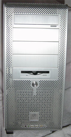
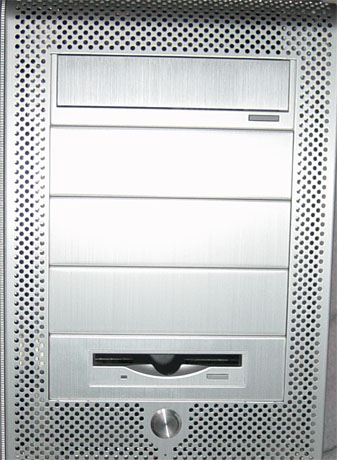
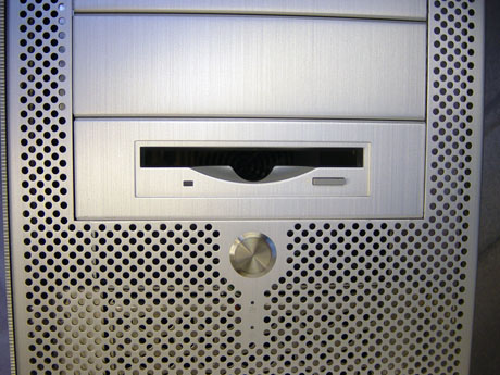
When first looking at the PC-V1000 out of the box, it seems like an ordinary chassis with a few custom touches. The entire front bezel as well as the bottom and a small section at the back of the chassis are covered with small round holes, which allow for increased air flow during system operation.There are a total of five 5-1/4" drive bays exposed, where the 1st bay is occupied by a matching CD-ROM bezel and the 5thbay is occupied by the 5-1/4" to 3-1/2" drive bay converter/bezel. This leaves three 5-1/4" drive bays free.
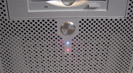
Directly below the drive bays are the Power button and the power and HDD LEDs. Lian Li decided to leave the reset button out of this design, which will limit that functionality. The internal connector for the power button is also mislabeled as "reset sw", which could be confusing to some. The power and HDD LEDs are a bit small compared to those on their previous cases, but are bright and easy to see.
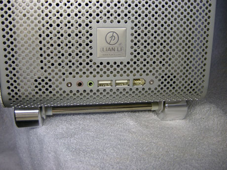
At the bottom of the front bezel are the auxiliary connections for audio (headphones and mic), dual USB, and Firewire. They seem to blend in with the rest of the face quite nicely.
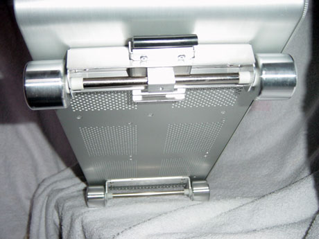
The PC-V1000 also has aluminum wheels that allow users to roll the case forward and back. Since the wheel mountings are screwed on, they can be removed easily with a Philips head screwdriver if preferred. The back wheels can be locked to keep the chassis from rolling.
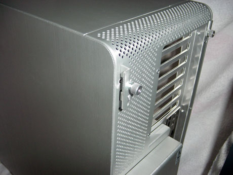
The side panels are made of the same thick aluminum as the rest of the chassis and have rounded corners to fit the shape of the case. The edges of both panels also have a saw-tooth style cut to give the PC-V1000 an industrial look.
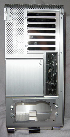
The minute we turned the PC-V1000 around to look at the backside, we noticed something different about it. It looked like the case was turned upside down, and this is where the realization of the new design came in to play. If you can visualize a standard case, the power supply is mounted at the top with optional case fans directly below it and the add-on card openings below that. With Lian Li's introduction of this new design, everything from the motherboard back is turned upside down: power supply mounted at the bottom with the motherboard above it.
The panel to access the PC-V1000's internals is now on the right panel. To remove either panel, we unscrewed what looked to be traditional thumbscrews, but were surprised to find them attached to the chassis. We found that Lian Li has designed a locking mechanism for the side panels, making them easier to remove and replace than the traditional sliding panel design. We pulled on the thumbscrew to release the mechanism and remove the tray.




32 Comments
View All Comments
jdepew - Friday, April 30, 2004 - link
Kinda funny that at a site like AnandTech, there was absolutely no reference mde to the G5 (extensvely commented on) or that fact that this isn't some new design for a case but an attempt at an amalgomation between ATX components and the new BTX form factor design.Come on guys --- cover how much it is like a BTX case and what we can expect with the new format!
katka - Thursday, April 29, 2004 - link
$200 is NOT a value, I guess I will wait for the knock offs. :(jiulemoigt - Thursday, April 29, 2004 - link
I t amazes me no one seems to notice you have this nice ventlation then you put a soild block of alumium across where the air should be fowing, evenly through out the case. That is horrible constrution I don't care if it sturdier, as more weight and heat sitting on the most expensive componets is a bad idea in the long run.jiulemoigt - Thursday, April 29, 2004 - link
LtPage1 - Thursday, April 29, 2004 - link
well, it was only a matter of time that someone copied the G5.too bad they made an INCREDIBLY UGLY copy of it. they kept the least attractive part (the cheese-graterishness) and left out everything that makes the g5 great. hmm. sounds a bit like Mac OS and Windows.
madgonad - Thursday, April 29, 2004 - link
I'm amazed at the thermal properties. I guess 10 pounds of aluminum and a porous skin is a good thing. Maybe someone can take a IR pic of one running to see how much heat radiates versus blown out the back.More important is the lack of reset button, and massive traffic jam of cables going through that eliptical plastic hole. If parallel cables are in your future, this case is not for you.
Murst - Thursday, April 29, 2004 - link
This design has to be the worst I've ever seen from Lian Li. Forget the looks (I never really cared about that), but all the holes? That's insane. I have a filter on my fans for a reason. Although I don't smoke in the room that my computer is in (wish I could, but that's not an option), there's a ton of crap in the air still and taking a look at the filter every day proves that. Now, short of having a completely filtered ROOM (don't even bother opening a window), your entire motherboard + perhiprals will get not only dust, but anything under 2mm on them (that happens to be in the air). This just seems absurd.Sure, even with a filter your stuff will eventually get dirty, but nothing like this.
Falloutboy525 - Thursday, April 29, 2004 - link
dang I was hopping the "value" lable on lian li website meant it would cost around 80-150 oh well..... wounder how much the V2000 is going to be thats the on I wantKristopherKubicki - Thursday, April 29, 2004 - link
This case has very little to do with the G5 design. It really doesnt even look like one, particularly on the inside.Kristopher
mkruer - Thursday, April 29, 2004 - link
Four things,First, I still like the design of the PC-60 through P-65 & the PC-70 thorough PC-75 the best.
Second, Why do they neve place all the USB and audio ports on the top or the sides? I don’t know about you but I don’t know about everyone else but I like to keep my desktop klean, and that relegates the floor for the system. Placing the connection on the side or top seems more logical then at the bottom of the case.
Third, I am glad that the PSU is now at the bottom of the case, I have been waiting a long time for that to happen.
Forth, to improve Air flow why don’t they cut out back where the fan is? This would reduce the noise the most. It’s the fan against the cheese grater back that it producing all most of the turbulence in the air, hence the noise. There is also lese resistance. For the air flow.