Lian Li's PC-V1000: A Case Exclusive
by Purav Sanghani on April 29, 2004 12:05 AM EST- Posted in
- Cases/Cooling/PSUs
Internal Design
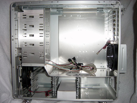
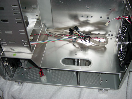
Upon removing the right access panel, we found an almost redesigned/redefined ATX style layout. The case is partitioned into 2 sections; the top 2/3 contains the 5-1/4" drive bays on the left (front of case) and the motherboard tray on the right (back of case). The bottom 1/3 section contains the 3-1/2" drive bays on the left and the power supply mounting at the right.The 2 main partitions are separated by an aluminum panel, which has an elliptical cut hole for wiring to pass through. For added protection, the edge of this hole is lined with a plastic guard as shown in the picture. The bottom 1/3 is also separated by an aluminum panel and also has an opening for wiring between the power supply and hard drives.
We found one major problem with the partitioned design and the use of standard flat IDE cables to connect hard drives to the motherboard. The cutout is placed in a way that does not allow the short IDE cables to pass through and reach IDE connections on standard motherboards. Owners of SATA drives won't have such a big problem with this, besides the fact that so many wires, SATA and power, will be running through this rather small opening. Considering that there are 6 bays for 3-1/2" drive applications, SATA is the only logical option, since its data cable is much smaller than standard IDE, and much quicker than round IDE cables.
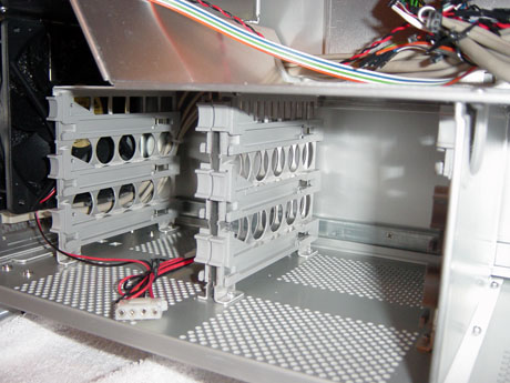
A feature that we noticed in the PC-V1000 was the tool-less hard drive mounting device. Though it cannot be compared to the drive rail method, it's just as easy to use. To mount a HDD, screw in the included HDD fixed screws onto the HDD (2 on either side) and slide it into one of the six built-in guides.
We were not so lucky to be able to test this feature, since the included screws were of the wrong type; rounded heads and a bit longer than what would fit into the slots. We have contacted Lian Li about this to ensure that the final product will include the correct hardware.
Though the PC-V1000 is not completely tool-less, it does have features that make up for this, and its new design layout made sense to us. For example, placing the hard drive bays as well as the power supply lower in the chassis drops the center of gravity, which helps keep the case from tipping over.


32 Comments
View All Comments
beachbum86 - Tuesday, September 27, 2005 - link
this case both looks and performes GREAT. the only problem that i havnt seen anyone point out is...dust.. with all those holes your bound to get dust build up... but this case is great. everyone posting obvioulsy just slappes in components to a case and calls it good.if you dont like the look...change it. add a front blowhole. put some lighting behind those holes to make some glow effect. alot of you guys that are complaining about looks, are what i like to call "lazy builders". so who cares if it looks like a G5. what about all the other cases that look like ...well, all the other cases. lian li helped break the mold of the normal case look that you guys are so intent on sticking with..your bunch of fallowers is it...learn to be a leader.
the case performes great (better than the rest) and it looks exactly how lian-li wanted.
racolvin - Monday, July 26, 2004 - link
Personally I'm ok with G5-copy look to it (aluminum, lots of hole .. you can't tell me this isn't "inspired by a G5). I'm even ok with the price for it.However ...
I will not now nor will I ever buy a tower case with the USB/Audio/Firewire ports on BOTTOM of the friggin case! As much as I would love to buy a new tower case and build a new system, this floor placement of the ports it totally unacceptable. Heck, the cable for my headphones would never reach from the floor to my head! Much less the task of plugging/unplugging my digital camera or iPod. No, I'll keep my $200 thank you very much
melgross - Sunday, May 9, 2004 - link
This case seems to be ok. The one thing it tends to prove is that off the cuff ideas of what is correct is often proven wrong by real engineering. Just looking at a case and thinking,"I don't know, it doesn't look like the cooling should work", is meaningless.By the way, having holes all over the front is not a new idea. Dell's servers have a fully perforated front just like Apple's do.
Most other servers I have seen over the years either have a mesh front, or a completely open front with the hard drive cases constituting the front panel and such. The idea isn't to create a tornado, but a constant flow over all areas with several fans in the rear. I've never seen these servers using filters, as that just cuts the air flow. Usually these are in conditioned, and filtered rooms to begin with, and aren't on a dirty floor. Vacuum once a week!
MajorKong - Wednesday, May 5, 2004 - link
How do you manage to review a case, complete with a dozen or more pictures of the empty case, but then provide NO pictures of the case with installed motherboard and other components?MWWInc - Saturday, May 1, 2004 - link
#9 - I would like to see pics of the assembled system as well. I bought one of those floppy bezels on my PC69 and happen to think they don't look good when there's an actual drive installed there.#13 - I agree that they could be more creative with the placement of the USB/audio ports, especially with the new "upside-down" layout where the extra USB headers on the board will probably be closer to the top of the case anyway.
And speaking of the layout, it seems like if you install hard drives in that bottom cage, your ATA cables are going to go on forever. (Pic: http://www.overclockercafe.com/Reviews/cases/Lian_...
It definitely borrows from the G5 look, but I have no problem with that, and seems to perform pretty well. But no removable motherboard tray, no reset button, no 2nd 5.25" bezel, and the cabling nuances mentioned above keep it from being the perfect case. And I would only consider spending $200 on a perfect case. ;-)
Brucmack - Saturday, May 1, 2004 - link
Something tells me the case would look better in black. Then the holes wouldn't be quite so loud, if you know what I mean.At least they put a filter over the intake fan, since that's where most of the air would come into the case, I would think.
Eug - Friday, April 30, 2004 - link
This is definitely a knockoff of the G5 externals, except that it doesn't look anywhere near as good.I like the G5 case, and I like Lian-Li's other cases, but this one is just Meh.
KristopherKubicki - Friday, April 30, 2004 - link
jdepew:It is pretty simple; the case isnt a G5 knock off (thats why it wasnt mentioned). Please check this out:
http://www.apple.com/powermac/design.html
Besides the little ventilation holes, there isnt a single resemblence between the two cases.
Kristopher
LoneWolf15 - Friday, April 30, 2004 - link
One more thing. Thanks Purav, for clearing up that power supply question. Much appreciated.LoneWolf15 - Friday, April 30, 2004 - link
I think it'd be a decent case, but it falls short on several things. Number one is price. That's ridiculous, and I'm not willing to pay it.The second issue I have is the cooling design. Separation of the hard disks from the rest of the system is a good idea in my mind provided it actually separates their heat from the CPU compartment, but both areas have to have ventilation systems dedicated to cooling them separately. I don't see that this case is really well designed for that. I was surprised by the cooling results being as good as they were, while the holes probably allow for good circulation, I was sure they would hamper adequate suction for the fans.
Finally, most serious enthusiass now have both a CD/DVD-reader, and a separate writer. A second CD-door faceplate ought to come with this, especially at that price..