Apple's iOS 4 Explored
by Anand Lal Shimpi on June 22, 2010 3:27 AM EST- Posted in
- Smartphones
- Apple
- iOS 4
- Gadgets
- Mobile
New Auto Correct
Apple has one of the best approaches to auto correction and text prediction on the market today. I’d argue that its implementation is the one to beat in terms of ease of use for the majority of typing on a touchscreen keyboard. With iOS 4, Apple has mucked with the formula.
Simply updating to iOS 4 seems to cause the autocorrect dictionary to reset. My iPhone 3GS still needs to do a lot of learning as it keeps suggesting/autocorrecting things that I’ve never typed before in my life.
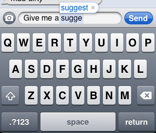
The iPhone’s system works like this: based on the keys you press (and those near the keys), the length of the word you’re typing and the autocorrect dictionary the iPhone will try to figure out what you were trying to type. If the word you type matches a known dictionary word, then nothing happens. If the word you type isn’t in the dictionary then the iPhone will look at the numbers of letters you typed as well as the keys you hit to try and figure out if you accidentally hit the wrong key(s). If it figures out what you did, it’ll use the dictionary to find the word you were likely looking to type and automatically replace the mistyped word. If it guesses incorrectly you have two options. During the guessing process the word the OS is thinking you’re trying to type will appear in a bubble above the word being typed. Tap the bubble to cancel the autocorrect.

Do it enough times and the unknown word gets added to the dictionary. If you type quickly and don’t give the bubble time to appear you can always hit backspace and you’ll get the option to go back to what you typed originally. In iOS3 this replacement was automatic, now you have to select the word you previously typed.

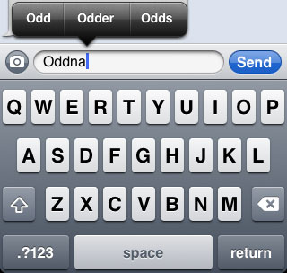
There’s also an expanded form of spell check in iOS 4. If you misspell a word and you don’t allow the single word autocorrect to fix it (or it can’t), the word gets a familiar red underline. Tapping the word will bring up a selection of multiple words that you might have meant instead.

In practice the changes do take some getting used to. It definitely clutters the typing experience with red underlines and word suggestion boxes popping up more than I’m used to. It’s not Android-cluttered but it’s a step away from the super simple iPhone keyboard of before.


46 Comments
View All Comments
jigglywiggly - Tuesday, June 22, 2010 - link
I haven't used my iphone 3g in a while. I have been using the Droid and HTC EVO 4g.These features have all been implemented better in Android anyway lawl.
Rnair - Tuesday, June 22, 2010 - link
I wonder why the other sites are not as objective! I understand IOS 4 and its pros and cons a bit better now :).medi01 - Tuesday, June 22, 2010 - link
I could only imagine how "objective" other sites are.Anand's site doesn't dare to display iSomethings in a bad light. Check recent article on android devices,
iphone is visible next to android phones, when it has advantage, but "incidentally dissapears" when it would look terrible (screen contrast).
What a shame... :(
deputc26 - Tuesday, June 22, 2010 - link
Yeah i noticed the selective presence of the iphone in that android review as well.Affectionate-Bed-980 - Tuesday, June 22, 2010 - link
You mean Anandtech only knows phones that are sold in the US? The rest of the phones fail to receive coverage. We all know how biased and limited the US cell phone market is. It only glances at part of the industry and only reveals part of the entire market. There's much more out there. Thank goodness for the N900 review, but honestly, if you want to do smartphones, do it like other sites do. Cover EVERY phone.medi01 - Wednesday, June 23, 2010 - link
No, being oriented to a particular market is ok for me.But showing iSomething when it has advantage (even when it is irrelevant), but "incidentally" hiding it (the author explained it like: "oh, it was probably in my pocket", that explains it, right?), when it sucks balls (contrast, for starters) is a shame.
So it seems that we have Mr Jobbs corporation, that sells a fraction of Nokia's market share, but that enjoys free, positive or very positive but god forbid negative, coverage in press.
I recall anand's site as rather objective (even though they seem to aggressively punch AMD quite a bit more than deserved recently, it was rather subtle, compared to what other sites do), so it's VERY frustrating, that it also bends to a Mr Apple's will.
:(((
Rnair - Tuesday, June 22, 2010 - link
I agree that the smartphone is getting more and more complicated. Good for us teck geeks :).But, Is it time to get back to the roots and introduce a version that is more basic, anyone for an iphone mini (an ala kin) ?
eirikma - Tuesday, June 22, 2010 - link
...then windows 95 is a cluster operating sytem. Even old versions of symbian does better than that.Any smart phone user who've tried using a computer knows that there are limits to how many thing you can do at once. When things stop working, you have to close down something. It is actually that simple - you don't have to "invent" absolutely everywhere.
SkullOne - Tuesday, June 22, 2010 - link
Yeah but this is Apple we're talking about. If they didn't invent or improve upon it then it sucks. ;) My Droid has never run out of memory with its multitasking and I have it doing quite a bit at times.Apple didn't do multitasking "the right way." They did it half-assed and claim that it's magically delicious.
All I can say is it's about time iOS finally caught up to Android...oh wait they're still behind because Android 2.2 is upon us bringing JIT compiler and Flash 10.1.
I'll keep my rooted, overclocked Droid with Froyo ROM thanks. Hope iPhone users enjoy iAds. AdMob in apps on my old iPhone 3G drove me insane, glad my Droid doesn't have that problem. It's nice actually having control over the hardware you pay for. ;)
sigmatau - Tuesday, June 22, 2010 - link
Multitasking is not at all what I expected and am very dissapointed. This is one feature I have been waiting for several months.I found the memory problem myself using Safari and multiple tabs. Some of the multiple tabs would dump whenever you scrolled through them, and then all of them would dump when you would switch to another app and back to Safari. I cleared out all the "multitasking" apps and opened up Safari again. I reloaded all tabs and they stayed fully loaded when I switched to a system monitor app to look at my memory.
Before clearing out the "multitasking" apps I had 5mb of free RAM. After clearing out the "multitasking" apps, I had 125mb free. They really, really need to give you the option to chose what to multitask. Why do I need Phone, Settings, Contacts, Clock to go in the "multitasking" bar? It makes no sense. Apple is 1 year behind others in implementing multitask and it surely is not as good as the competition.
I wont even go into being pissed that they haven't fixed the basic phone alert functions and other simple things you could do with most other free phones never mind smart phones.